
The click is the cheapest part of the funnel
A cheap click feels like progress. It is not. Meta charges you for the click. It does not charge you for the sale. When the sale never happens, the click was not a win.
We see the same pattern in most accounts we audit. Click-through rate looks healthy. Add-to-cart rate sits near zero. The owner decides the audience is wrong, raises the budget, widens the targeting. Nothing changes, because the audience was never the problem.
The ad did its job. The path after the ad did not.
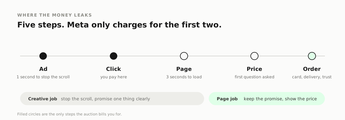
Four places the sale breaks
1. Message match
The ad promises one thing. The landing page opens with something else. The visitor spends three seconds working out whether they landed in the right place, then leaves.
A real example. The ad says "Full mouth implants from 249 a month". The page headline says "Welcome to our clinic". Different words, different job. The visitor came for a price and got a greeting.
The fix is not clever. Repeat the ad's exact promise in the first screen. Same words, same offer, same image if you can. The click should feel like it did not take them anywhere.
2. Price shock
If the price only appears at checkout, every step before it is a guess. People who cannot afford it still click, because nobody told them. You paid for those clicks.
A price on the ad filters. So does a range ("from 249"), a payment plan, or a "book a quote" step that sets the expectation before the click.
The trade is simple. A price in the ad lowers click volume and raises lead quality. For local and high-ticket services, the second number is the one that pays.
3. Page speed
A page that takes more than three seconds to render on mobile loses people before it appears. That is not an opinion about design. It is what happens in the browser.
Test on a phone with the network throttled, not on a laptop on office wifi. If the hero image is a 4MB PNG, you have found the problem.
Fix the weight first: compress to WebP, remove the carousel that loads six slides, stop loading chat widgets before the headline.
4. Proof
The visitor is one click away from a stranger's website. Trust has to be visible without scrolling. Reviews, a real photo of the team, a before and after, a client name you are allowed to use.
A stock photo of a smiling model is not proof. It is decoration.
How to tell which one is broken
Read the numbers in order. Each one shows where the drop is.
- High clicks, low add-to-cart: price or page.
- High clicks, under ten seconds on page: message match.
- Long time on page, no checkout: price or trust.
- Good add-to-cart, no purchases: payment friction or delivery cost.
Do not jump to the last row. The first drop is the one to fix.
On "just test more creative"
More creative helps when the ad is the bottleneck. It does nothing when the break is after the click. If the page fails the four checks above, a new hook only buys more expensive visitors to the same dead end.
The order we fix things
- Match the page headline to the ad promise.
- Compress the hero image and remove whatever blocks the first render.
- Put proof above the fold: reviews, photos, numbers you can back up.
- Put price, a range or a payment plan in the ad and on the first screen.
- Only then test new angles.
Steps one to four usually take a day. Step five is where most people start.
The three-second test
Open your ad on a phone. Tap it. Count to three. If you cannot tell what is being sold and what it costs, the page is losing money.
We run this on every account before we change a campaign. It is free, it takes a minute, and it catches problems that no amount of audience testing will fix.
Three things should be true inside those three seconds:
- The page repeats the ad's promise in the headline.
- A price, a range or a payment plan is visible.
- There is proof nearby: a review, a number, a real photo.
If two of the three are missing, the ad is not the problem.
What to change first if you can only change one thing
Change the headline. Not the design, not the button colour, not the ad copy. The headline.
The headline is where the ad's promise either continues or dies. A page with an ugly layout and a matched headline still converts. A beautiful page with a headline about the company rather than the offer does not.
Write it as the same sentence the ad used. Keep the price. Keep the outcome. If the ad said "Implants from 249 a month", the headline says it too, and the button says "Book a consultation", not "Submit".
A short example
A clinic ran one ad with a strong hook and a 4.1% click-through rate. The landing page was a homepage with a video, a menu of eight treatments and a contact form at the bottom. Purchases: zero.
Three changes, one afternoon:
- The homepage hero became the implant offer, same wording as the ad.
- The price and the payment plan moved above the fold.
- Two reviews and a clinic photo replaced the stock hero image.
Same ad. Same audience. Same budget. The enquiries started arriving the next day. Nothing about the campaign changed, because the campaign was never the broken part.
What good looks like
The visitor clicks and lands on the same promise, the same image and a price they expected. They never have to wonder whether they are in the right place. That is the whole job of the page. Everything after it is ordinary buying behaviour.
If you want this checked
Send us the ad and the page it points to. We will tell you which of the four steps is broken, in plain English, without a call.
Searches this answers
- meta ads clicks but no sales
- facebook ads high ctr no conversions
- facebook ad clicks no purchases
- message match landing page ads
- why are my meta ads not converting
- facebook ads traffic but no sales
NEED THIS APPLIED TO YOUR OWN ADS?
Get a free ad audit